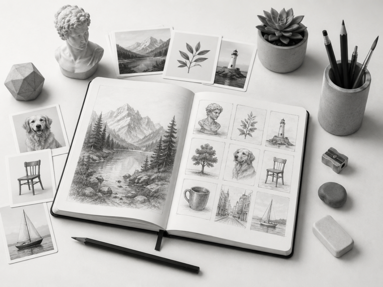
Character Design for Beginners
Designing your own original character is one of those things that sounds way more intimidating than it actually is. For years I only ever drew other people’s characters, fan art of my favorite shows, because the idea of inventing someone from scratch felt like a job for “real” artists. Then I finally tried it, fumbled through a bunch of mistakes, and realized character design is mostly just a handful of decisions stacked on top of each other. Anyone can learn it. So today we’re doing character design for beginners, and by the end you’ll have a real method for turning a blank page into a character that feels like someone.
This isn’t about being a professional concept artist. It’s about having fun making your own little guys. Let’s go.
Start with a role, not a face
The number one mistake I made early on was starting with the face. I’d draw a cute face, then get stuck because I had no idea who this person was, so they ended up generic and forgettable. The fix is to flip it. Start with who they are, not what they look like.
Give your character a role or a job first. A space mechanic. A retired boxer. A village blacksmith. A monster therapist (yes, really, that’s a fun one). The role instantly generates a hundred design clues. A space mechanic has grease stains, a utility belt, practical clothes, maybe a cybernetic arm. A retired boxer has a specific build, old scars, a worn-in confidence. The job tells you the design. That’s the whole trick.
If you’re not sure where to start, the character drawing prompt generator hands you a role plus an outfit detail and a pose, which is honestly the perfect launchpad. You get something like a “storm chaser with a strange helmet” and suddenly your brain has somewhere to run.
Silhouette is everything
Here’s a pro concept that’s actually beginner-friendly: a great character is recognizable from their silhouette alone. If you filled your character in solid black, could you still tell who they are? The most iconic characters in fiction pass this test. Their outline is distinct.
So when you design, think about the overall shape. Are they tall and spindly? Short and round? Do they have a big dramatic coat, a giant backpack, wild hair, a weird hat? Give them one or two strong silhouette features that make their outline pop. A flowing cape, oversized boots, a tiny companion creature on their shoulder. These shape choices do more for “memorable” than any amount of detailed rendering.
Use shape language to show personality
This is one of my favorite little secrets. The basic shapes you build a character from actually communicate personality, and our brains read it automatically.
- Round shapes read as friendly, soft, harmless, cute. Think of most cuddly mascot characters.
- Sharp, angular shapes read as dangerous, clever, edgy, or villainous. Lots of triangles equals “be careful.”
- Square, blocky shapes read as strong, stable, dependable, sometimes a bit dim but lovable.
So if you want a gentle healer, lean round. If you want a sly assassin, lean sharp. If you want a sturdy guard, lean square. You can mix them too, like a round friendly body with a couple sharp details to add a hint of mischief. Once you start noticing shape language in characters you love, you can’t unsee it, and you’ll start using it on purpose.
Give them one strong color story
You don’t need to be a color genius. You just need restraint. A super common beginner mistake is using every color in the box, which makes a character look chaotic and cheap. Instead, pick a small palette: one or two main colors, a neutral, and one bright accent for the eye to land on.
Think about what the colors say, too. Cool blues and grays feel calm or distant. Warm reds and oranges feel energetic or aggressive. A single pop of a bright color, like a red scarf on an otherwise muted character, draws the eye exactly where you want it. If you’re working in black and white for now, the same logic applies to value: keep most of the character in a middle tone and save your darkest darks and lightest lights for the spots you want to emphasize.
The details that sell the story
Once the big shapes, silhouette, and palette are set, you sprinkle in the little storytelling details. These are the things that make people go “ooh, who is this.” A cracked badge. A rolled-up map. Burn marks on a sleeve. An old key on a necklace. Mud on their boots. Each tiny detail implies a whole backstory without you having to write a word of it.
The key is that details should feel earned by the character’s role. A junkyard pilot having loose wires and scratched goggles makes sense. A tea master having those same things would be confusing. Let the details answer questions the role raises, and your character will feel coherent and real instead of like a random pile of cool stuff.
Pose and attitude
A character standing perfectly straight, arms at their sides, looking at the camera is the visual equivalent of a flat “hello.” Boring. The pose is your chance to show their attitude. Are they cocky? Let them lean back with a smirk. Nervous? Hunched shoulders, hands fidgeting. Heroic? Chin up, feet planted, looking off into the distance.
Even a small tilt of the head or shift of weight changes everything. When I’m designing, I do a few quick thumbnail poses before committing, just little stick-figure gestures, to find the one that best screams who this character is. The prompts that include a pose are great for this because they nudge you toward dynamic choices like “landing from a jump” or “casting a small spell” instead of the default boring stand.
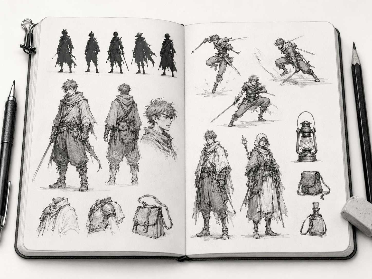
A full example, from nothing to someone
Let me walk you through one so it clicks. Say I generate “rookie wizard with a torn cape, casting a small spell.” Here’s how I build them.
First, the role: rookie wizard. Rookie means young, a little clumsy, not yet powerful, probably enthusiastic. That tells me to lean into round, friendly shapes with maybe one slightly-too-big element to show they haven’t grown into the role yet, like robes that are a size too large. The torn cape is a storytelling detail, so I ask why it’s torn. Maybe their spells keep backfiring. That implies singe marks and a slightly frazzled look, which I add. For palette, I give them deep blue robes with a single bright accent on their little glowing spell. For pose, “casting a small spell” lets me show personality, so I make them mid-cast with an expression that’s equal parts concentration and “please work this time.” And just like that, a random prompt became a specific, sympathetic little character with an implied story. That’s the entire process.
Practice by designing fast and often
The way you get good at character design is the same as everything else: volume. Design lots of characters quickly rather than agonizing over one for a month. Each fast design teaches you something, and the more you make, the more your personal style starts to emerge from the patterns of what you keep choosing.
Set yourself a little challenge: design one character a day for a week, each from a fresh prompt, spending no more than fifteen or twenty minutes each. Don’t polish them, just nail the role, silhouette, shapes, and one or two details. Use the character generator to feed you a new starting point each day so you never stall on “who do I make.” By the end of the week you’ll have a little roster and a much better feel for the whole process.
Avoid these beginner character traps
A few mistakes show up constantly in early character work, and knowing them ahead of time saves you a lot of frustration. Here are the big ones to watch for:
- Symmetry overload. Perfectly balanced characters feel stiff and boring. Break it up, an asymmetrical hairstyle, a bag on one shoulder, a scar on one side. Imbalance reads as natural.
- Detail with no hierarchy. Cramming detail everywhere gives the eye nowhere to rest. Pick a focal area (usually the face or a signature item) and let other areas stay calmer.
- Costume that ignores the body. Clothes should drape over and wrap around the form underneath, not sit flat like stickers. Always feel the body inside the outfit.
- Copying a single influence too closely. It’s fine to learn from one artist, but blend a few influences so your character feels like yours, not a clone.
Don’t stress about avoiding all of these perfectly on day one. Just keep them in the back of your mind, and when a design feels “off” but you can’t say why, run down this list. Usually it’s one of these four, and naming the problem is most of the fix.
Make your little guys
Character design really does come down to a stack of small, learnable decisions: pick a role, build a strong silhouette, use shape language for personality, keep a tight palette, add storytelling details, and give them a pose with attitude. Do those things and even your very first original character will have more life than a perfectly rendered face with no story behind it.
So go make somebody. Open the character drawing prompt generator for a starting spark, or the main drawing prompt generator if you want to fold character work into a broader practice. Give your new little guy a weird job and a torn cape and a reason to exist. I promise it’s more fun than drawing the same fan art for the tenth time. Now go invent someone.